The psychology of color as it relates to persuasion is one of the most interesting — and most controversial — aspects of marketing.
The problem has always been depth of analysis. Color theory is a topic of complexity and nuance, but splashy infographics rarely go beyond See ‘n Say levels of coverage.
The importance of color in branding
First let’s address branding, which is one of the more important issues relating to color perception and the area where many articles on this subject run into problems.
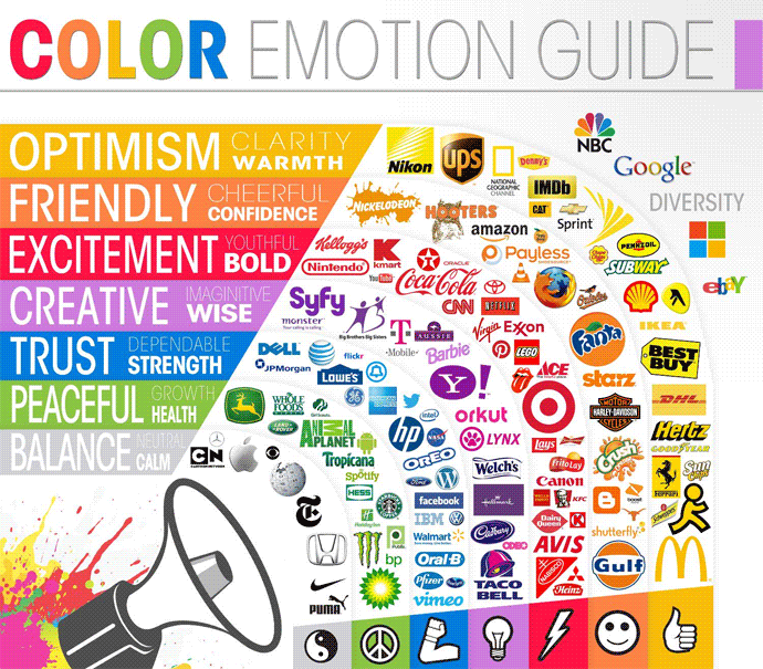
As mentioned, there have been myriad attempts to classify consumer responses to different individual colors:
 Credit: The Logo Company
But the truth is that color is too dependent on personal experiences to be universally translated to specific feelings. There are, however, broader messaging patterns to be found in color perceptions.
In a study titled “Impact of color on marketing,” researchers found that up to 90% of snap judgments made about products can be based on color alone, depending on the product. Regarding the role that color plays in branding, results from another study show that the relationship between brands and color hinges on the perceived appropriateness of the color being used for the particular brand (does the color “fit” what is being sold?).
A study titled “Exciting red and competent blue” also confirms that purchasing intent is greatly affected by colors due to their effect on how a brand is perceived; colors influence how customers view the “personality” of the brand in question. Who, for example, would want to buy a Harley Davidson motorcycle if they didn’t get the feeling that Harleys were rugged and cool?
Additional studies have revealed our brains prefer immediately recognizable brands, which makes color an important element when creating a brand identity. One journal article even suggests it’s important for new brands to pick colors that ensure differentiation from entrenched competitors — personally, I think we’re getting into minutiae without additional context, such as how and why you’re positioning against a direct competitor, and how you’re using color to achieve that goal.
When it comes to picking the “right” color, research has found that predicting consumer reaction to color appropriateness is far more important than the individual color itself. If Harley owners buy the product in order to feel rugged, colors that work best will play to that emotion.
Psychologist and Stanford professor Jennifer Aaker has conducted studies on this very topic, and her paper titled “Dimensions of Brand Personality” points out five core dimensions that play a role in a brand’s personality.
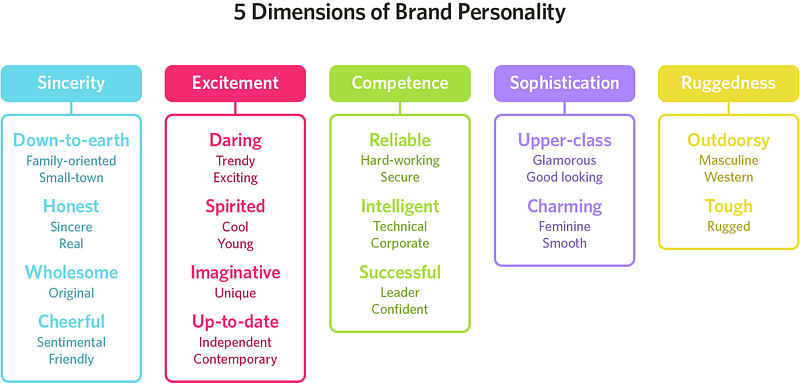
Brands can sometimes cross between two traits, but they are mostly dominated by one. While certain colors do broadly align with specific traits (e.g., brown with ruggedness, purple with sophistication, and red with excitement), nearly every academic study on colors and branding will tell you that it’s far more important for colors to support the personality you want to portray instead of trying to align with stereotypical color associations.
Consider the inaccuracy of making broad statements such as “green means calm.” The context is absent: sometimes green is used to brand environmental issues, like Seventh Generation, but other times it’s meant to brand financial spaces, such as Mint.
And while brown may be useful for a rugged appeal — see how it’s used bySaddleback Leather — when positioned in another context, brown can be used to create a warm, inviting feeling (Thanksgiving) or to stir your appetite (every chocolate commercial you’ve ever seen).
Bottom line: There are no clear-cut guidelines for choosing your brand’s colors. “It depends” is a frustrating answer, but it’s the truth. However, the context you’re working within is an essential consideration. It’s the feeling, mood, and image that your brand or product creates that matters.
Color trends for men and women
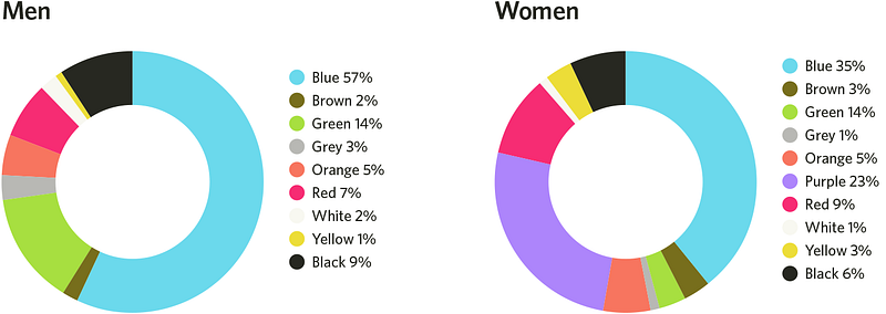
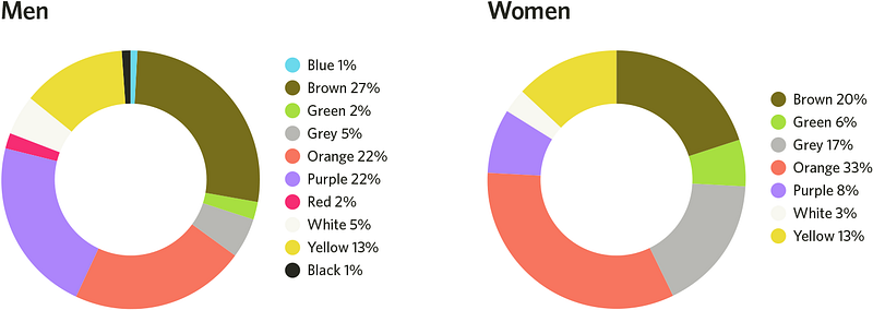
One of the more interesting examinations of this topic is Joe Hallock’s work on “Colour Assignment.” Hallock’s data showcases some clear preferences in certain colors across gender (most of his respondents were from Western societies). The most notable points in his images are the supremacy of blue across both genders and the disparity between groups on purple.
It’s important to note that one’s environment — and especially cultural perception — plays a strong role in dictating color appropriateness for gender, which in turn can influence individual choices. Consider, for instance, this coverage by Smithsonian magazine, detailing how blue and pink became associated with boys and girls respectively, and how it used to be the reverse.
Here were Hallock’s findings:
Men’s and women’s favorite colors
Men’s and women’s least favorite colors
Additional research in studies on color perception and color preferences show that when it comes to shades, tints, and hues, men generally prefer bold colors while women prefer softer colors. Also, men were more likely to select shades of colors as their favorites (colors with black added), whereas women are more receptive to tints of colors (colors with white added).
Although this is a hotly debated issue in color theory, I’ve never understood why. Brands can easily work outside of gender stereotypes — in fact, I’d argue many have been rewarded for doing because they break expectations. “Perceived appropriateness” shouldn’t be so rigid as to assume a brand or product can’t succeed because the colors don’t match surveyed tastes.
Note: A version of this post was originally published on Help Scout. Head over to the Help Scout blog for more strong opinions on product, customer support, culture, and marketing.
Gregory Ciotti is on the marketing team at Help Scout, software for delivering outstanding customer support. You’ll find him writing about clear communication and editorial strategy on the Help Scout blog.
Tidak ada komentar:
Posting Komentar